WalknTalk’s Infinity Pad Swivels on a Pin and is Refillable.
Tired of the traditional notebook? If so, check out this innovative notebook design by WalknTalk, the Infinity Pad.
Rather than opening on the long side with a typical binding, the Infinity Pad cover pages spin on a post mounted on the short side of the journal giving this journal a completely different feel than what you are used to. You have quick access to your pages by using a simple turning motion and is functional for both left and right handers. Rather than opening flat to a two-page spread, this journal spins flat to a single page.

The Infinity Pad Spirals Open and Can be Used by Left and Right-handers. The pages are refillable with either plain or a musicians paper.
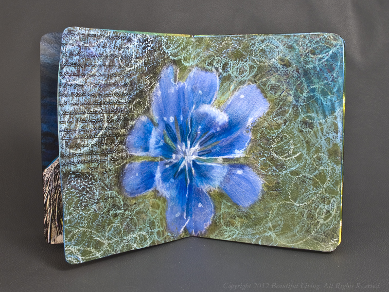
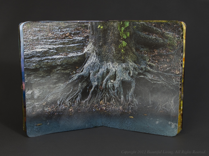
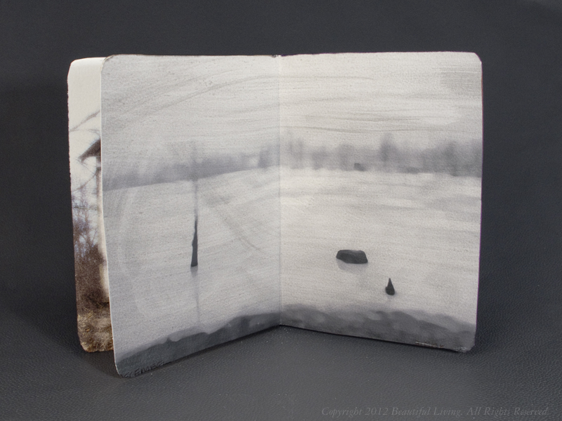
The paper is an eco-friendly, unlined cardstock which is very thick and handled my basic pen test better than anything I have tested to date. Even permanent markers performed well and did NOT bleed through the backside. Yes, that’s right, my Copic and Sharpie markers did NOT bleed through so you will likely be able to use both sides of this paper with just about any pen you choose. Since the ivory pages twirl rather than open like a standard notebook, the most convenient way to write on the backside of the paper is to do so after you have filled up the front pages, flip the journal over and start using the back side of the pages. Once you are finished with your pad, you can order refills for just $4.50 at Walkntalk.com.

The Musician’s Edition has 2 staves per page on one side and can also be used as a ruled pad if needed.
The Infinity Pad utilizes high grade materials that are sure to please even the pickiest journalers. The leather used on these journals is thick and luxurious and it smells wonderful. The texture is smooth on the outside and suede on the inside. The richly-colored covers seem like they will hold up well to the twisting and turning you will be doing. The cardstock pages have just the right amount of tooth and seem to handle just about anything.
The 3″ x 5″ pads fit easily into the back pocket of your jeans, pants and into some shirt pockets. A 5″ x 7″ size is also available for those of you who need more space. There is even a Musicians version of the infinity pad which has 2 staves per page, but you could also use this as a ruled version if you need lines. The Infinity Pads are available in a variety of luscious colors at WalknTalk.com.

The thick cardstock pages handled my inks with ease. Even the permanent Copic and Sharpie markers did not bleed through the backside.