
Image copyrighted by Sandra Kay Strait.
Sandra Strait puts Stillman & Birn’s Zeta, multi media sketchbook paper through its paces. Checkout her thorough review and beautiful illustrations at Life Imitates Doodles.
Posted in Art Journals, Creative Tips, Journal Reviews on March 25, 2013| 1 Comment »
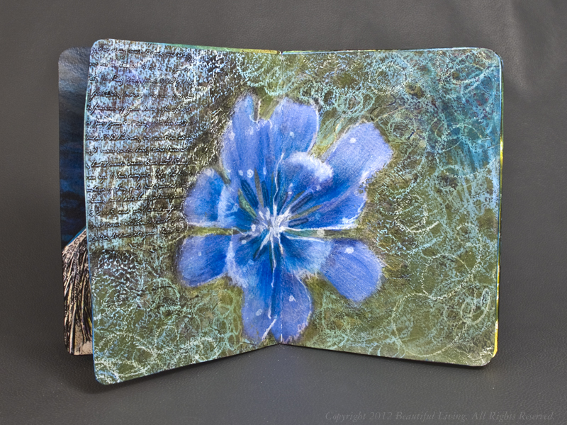
Image copyrighted by Sandra Kay Strait.
Sandra Strait puts Stillman & Birn’s Zeta, multi media sketchbook paper through its paces. Checkout her thorough review and beautiful illustrations at Life Imitates Doodles.
Posted in Art Journals, Creative Tips, tagged art journaling, arts, daniel boone national forest, sketchbook on January 21, 2013| 14 Comments »
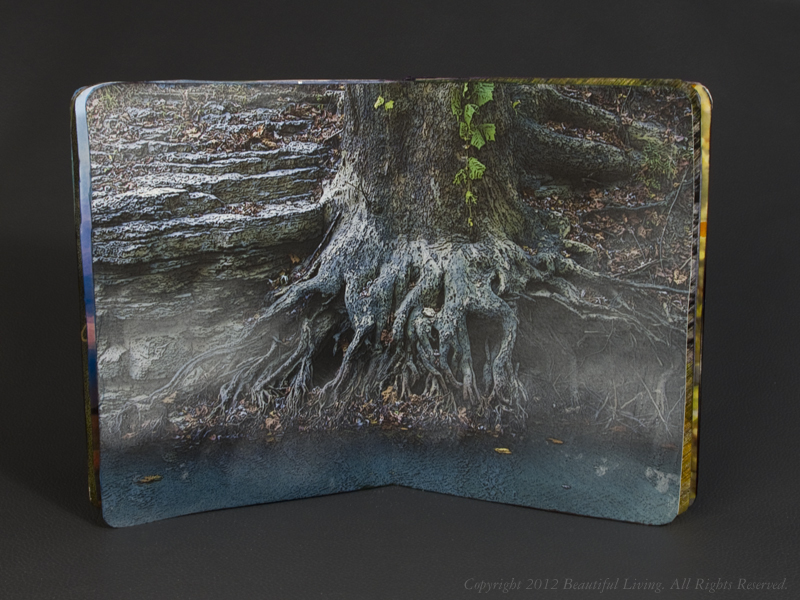
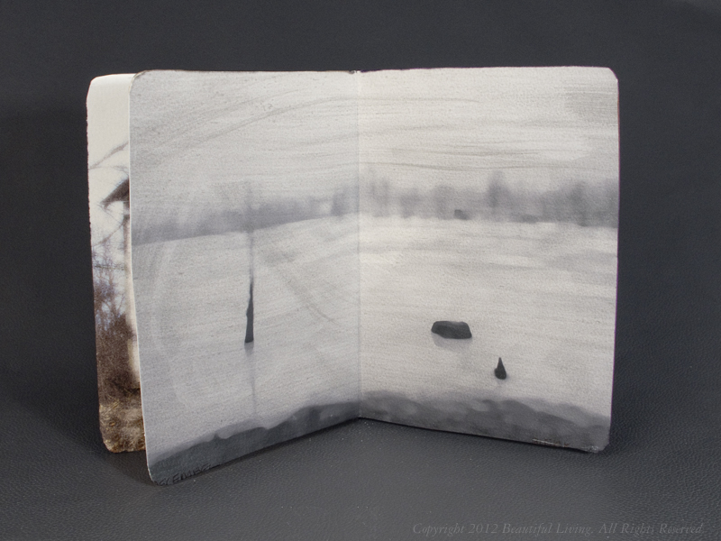
I recently submitted a sketchbook to The Sketchbook Project. The Sketchbook Project is a global, crowd-sourced art project where participants from all walks of life are sent a sketchbook to fill the pages and return it for inclusion in a traveling exhibition and permanent collection at The Brooklyn Art Library. Anyone – from anywhere in the world – can participate in the project. This year the tour will head to Brooklyn, Austin, Atlanta, Toronto, Chicago, Portland, SF and LA!
My submission included modified, digital photos I had taken around central Kentucky. I created twelve two-page spreads, each representing a month of out of the year. Each photo was printed on an Epson Ink Jet printer onto watercolor paper, and modified using pens, markers, oil pastels, gels and other artist mediums. Once complete, the pages were bound into a book a wrapped with a modified cover photo of beautiful Cave Run Lake in Daniel Boone National Forest, Morehead, Kentucky. These are the pages in the book, starting with the cover, January, February and so on.
To see the massive collection of sketchbooks at The Brooklyn Art Library, here is a link to the details: Brooklyn Art Library. If you want to get a closer look at my journal once you are there, the call number of my book is 194.12-9.


Posted in Creative Tips, Markers, Miscellaneous on October 22, 2012| Leave a Comment »
Wondering what to do with all of those empty pens in your desk drawer? Checkout this great recycling project by Costa Schuler, The Pen Guy.
Posted in Creative Tips, Markers, Miscellaneous, tagged Markers on March 12, 2012| 5 Comments »

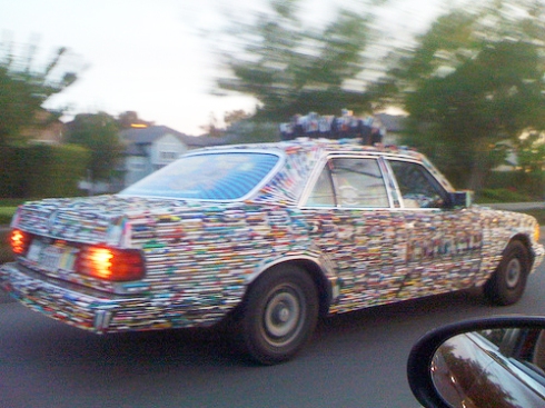
For those of you looking for creative was to you use Sharpie Markers, check out this idea from If It’s Hip, It’s Here. The world’s best known permanent laundry maker, the Sharpie, isn’t just for labeling your underwear. Hand drawn cars, basement walls, decorated ceramic busts and more like those shown here may make you rethink the way you use that stinky pen.
The car was actually done in sharpie markers on the paint and then finished with a clear coat for protection. It took about 2 weeks total. Prestige (Lamborghini Miami)definitely shocked a lot of people when this car was first seen in California during the Concorso Italiano/Pebble Beach week. It attracted attention good, and apparently bad as well, everywhere it went.
(images courtesy of VOD Cars and JT Photos on flickr)
Posted in Creative Tips, Miscellaneous on December 23, 2011| 1 Comment »
Happy holidays and a big thank you to all of you who follow my blog! I wanted to share a creative holiday message from Chronicle books that showcases some very creative ideas. Be sure to look for the snowflake created from journals!
I wish you all a super happy holiday and a very creative new year!
Posted in Creative Tips, Featured Artists, Miscellaneous, tagged Artists, Photography on May 15, 2011| Leave a Comment »

When creating art, we have many opportunities to combine mediums and processes to create images that speak to the observer. Georges Emmanuel Arnaud Geizm does a beautiful job of combining old and new technologies in his “Soul In Between Exposed“ series of photographs. Using a myPolaroid 220 camera and Photoshop, he has created images that seem to reveal the soul of the subject.
The beauty of using photography as an artistic form of expressions is the unique ability to capture the human spirit. In a fraction of a second, your photograph will capture things our eyes will miss. By changing the lighting, background, colors and mediums, it is possible to dramatically change the essence or meaning of the images you take into one that you wish to communicate.
To see more photographs by Georges Emmanuel Arnaud Geizm, be sure to visit his photography website.
Posted in Creative Tips, Miscellaneous, Past Work, Works In Progress, tagged art journaling, Creativity Tips, visual journal on February 28, 2011| 5 Comments »

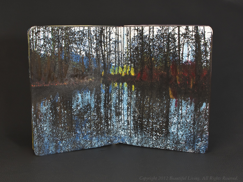
I’ve been dabbling in photography as an adjunct to art journals and sketching. I struggle with creating technically correct photographs, but a recent experiment yielded some interesting images that didn’t require me to be technically perfect. The subject was a dull, winter, Kentucky landscape, that would be boring, even if taken by a professional photographer. With a little help from Photoshop, I was able to transform these lifeless photos into something artistic.
These landscape blurs were created by moving my camera while exposing the shot. Using Adobe Photoshop to edit the images, I pumped up the color to enhance the otherwise dull images and the results are more art than photography. The real surprise was the rich textures and colors that appeared when I pushed the colors beyond safe levels.
I can see using this technique to create rich colorful backgrounds in future art journals or as a base for a collage or mixed-media art. If you have used this technique in one of your art journals or artwork, I’d love to know more about your project.


Posted in Art Journals, Creative Tips, Works In Progress, tagged art journaling, Journal Reviews, Oil Pastels, Sketchbooks, visual journal on August 24, 2010| 5 Comments »

This final image was created using a combination laser transfer, acrylic paint and oil pastel.
I love combining digital art with traditional art and one easy way to combine the two is by using laser transfers from your laser printer in combination with paints on paper.
This image was created using a laser transfer as the base image in my Ecosystems Sketchbook with layers of acrylic and oil pastel on top. Laser transfers are not acid-free, but by covering the image with acrylics and a final coating at the end, you will be able to make it last long enough to enjoy it. Please note that this method uses chemicals that should only be used in a well-ventilated area and that you should take adequate precautions when using petroleum-based thinners. Please read the precaution on the can of the product you are using and follow the safety instructions.

A color laser print out of a medallion was used to make the base image. I did not create a mirror image because I didn't care if the image was reversed from the way it was originally created. If you are using type or another image that needs to be in a specific orientation, be sure to you your printer's settings to print an inverted or mirror image of your design or photo.
To start, I designed and printed out an image using my drawing program. I intentionally used bright, saturated colors because some of the intensity is lost during the transfer process and I wanted my base image to be visible below several layers of paint. If I would have used lighter colors, the image would have been much more subtle. I printed the image on a color laser, but you can also transfer black and white laser images using this method.
Next, I placed the image face down onto my journal. Once the image was positioned, I applied a rag saturated with lacquer thinner to the back of the laser print and rubbed it into the page until I could see the image through the back of the paper. Note: It will take some experimentation to learn how your thinner works with your laser print, so if you are unsure of what results you will get, try the transfer first on a scrap piece of paper until you are happy with the results.
I applied the thinner to the entire image and burnished it to press the color into the paper. More burnishing produces stronger images although the transfer will never be as clear and sharp as the original printout. If you require more perfect transfers, other techniques which add another layer of material will work better such as Lasertran and inkjet transfers or Water Slide Decals.

Once the transfer was complete, I peeled away the color laser print out to reveal the image. Note the image is much softer than the original printout. This is quite normal and is to be expected using this technique. I can give your art an aged look that is difficult to achieve by hand.

The image transfer. Note how it is much softer than the original print.

I added metallic gold, acrylic paint that had been thinned with water to create a shimmery, aged look. It took several layers of this to build up enough color to create the effect I was after.

I used multiple layers of acrylic paints of different colors to add depth and intensity.

Once I had the background color the way I liked it and the paint was dry, I added horizontal pencil lines so I would be able add aligned text on top of the image. The pencil lines were very light to not obstruct the image.
I added hand-written text on top of the art using a white oil pastel. The oil pastel is dense and enabled me to create opaque, cursive text on top of the image. Once I was finished, I coated the entire piece with a clear acrylic spray to seal it and to prevent the oil pastel from transferring to paper or hands. The sealer also protect the artwork from dirt, grime and moisture.
this is filler
Posted in Creative Tips, Moleskine Planners, Moleskine Tricks, tagged Moleskine Hacks, Moleskine Planner, Moleskine Tips, Planner Reviews on July 21, 2010| 8 Comments »

Moleskine Volant Daily Planner hack uses a a paper clasp and paper folds.
The Moleskine Volant Daily Planners are are easy to use because of their thin profile and small size, but they lack an elastic strap and a ribbon place marker. This simple set of hacks will bring your Volant planner up to speed and add a pen holder, too. These solutions were shared with me by my good friend Alex, who will be a freshman in college this fall.
A Colorful Paper Clasp Will Keep Your Planner Closed and Add A Pen Holder
I was struck by the simplicity of this hack. Not only does a paper clasp do a great job of keeping the Volant planner closed, it can also be used to keep a pen with your planner. You can also use it to anchor your planner to larger books or notebooks. Paper clasps come in a variety of sizes and colors enabling you to to create the perfect combination of function and design.

Just clip on a paper clasp in your favorite color, fold back the arms, and your planner will stay closed and relatively flat. If you leave a little room between the bottom of the clip and the pages, you can slide a pen along the side. If you prefer to attach the pen using a pen clip, no problem, just slide the clasp towards the top of the planner and clip your pen on the corner of the clasp.
Origami-Inspired Paper Folds Keep You On Track In Style
Organization doesn’t have to be boring to be effective. Simple paper folds for days that have passed create a beautiful place holder in your planner. By folding the corners into the middle of the planner, alternating between the top and bottom, a v-shaped indentation is formed. This leaves a perfect, thumb-sized place to open to the current day. If you have days or pages that have passed that you want to refer to quickly, no problem, just color the folds for easy recall.

By folding the page corners of previous days into the planner in an alternating pattern, you can create a beautiful tab for the current planning day. Add colors and change the folds to create the look that suits you best.
Posted in Art Journals, Creative Tips, Journal Reviews, Works In Progress, tagged art journaling, Creativity Tips, Journal Reviews, Tombow Dual Brush Pens, visual journal, watercolor journal on May 16, 2010| 12 Comments »

The first page in my affirmation journal created with a laser printer transfer, marker and watercolor.
I have been wanting to experiment with transferring a laser printer image into a journal using solvents for a while. Since the weather is warmer, and I am able to work outside, I decided to start my newest journal creation, an affirmation journal, using this technique. The Ecosystem sketchbook paper seemed appropriate for this method with its bright white paper. Even though it is not as thick as the paper in a Moleskine sketchbook, it has a more porous surface and I thought it might take a transfer well.
On the first page of this journal I wanted to include a message that would express the overall theme of the journal and I wanted to create it primarily with text. Since my handwriting is awful, I created an illustration in my drawing program that would fit the page. Once I had a design I was happy with, I printed it out backwards, as a mirror image, so the transfer would read correctly when complete. Once I had my laser print out, all I would need to do is place it face down on the journal page and apply a solvent to the back of the print out to dissolve the laser ink so it would print on the journal page.

In order for the transfer to read properly on the page, I had to print my image out backwards on my laser printer. I placed this image face-down on the journal page to make the transfer.
I used lacquer thinner to make the transfer. It is pretty nasty stuff and should only be used outdoors or in a well ventilated area. This substance is not for everyone and if you are chemically sensitive, I would recommend that you avoid this technique.

I blotted the solvent on the backside of the laser print until I could clearly see the image below. I used a fair amount of pressure to be sure I was making good contact with the journal page. In some areas, I burnished the image while the paper was still damp for a stronger transfer. Once the solvent dries, the wet areas disappear.

To check my progress, I carefully lifted the paper to see how the transfer was being applied. I was careful to hold the paper in place to keep it lined up with the image.
When making the transfer, I applied the solvent using a paper towel and blotted the back of the paper until I could see the image clearly through the back. I found that burnishing the image while the solvent was still damp improved the depth of color. I did this slowly and checked my work frequently by lifting the laser print to see how well the transfer was being applied.

I added watercolor and marker to the transfer to complete the image.
Once the transfer was complete, I added a watercolor silhouette of my hand to relate to the hand on the cover and provide a subtle transition to the interior pages. This caused the paper to buckle a bit, but I did expect this since the paper is sketch paper and not watercolor paper. You can see the cover image I created in an earlier post here. To complete the illustration, I darkened the color of the large letters to add color and contrast to the image.

I added marker to the large letters for additonal color and contrast.
Final transfers using this method will be somewhat fuzzy and will never look as clear as the original. But this can be used to create images that look stamped or aged and adds an interesting effect to your art. It can be combined with other elements to give your designs a unique and professional look, and is worth experimenting with if you are looking for new ways to create art.
