Feeds:
Posts
Comments

Posts Tagged ‘art journaling’

This month’s carnival has some great posts featuring some of our favorite things. Visit the following blogs for great reviews and more. Art Journaling

Notebooks & Journals

Pens & Markers

Inks & Other Reviews

Submit your blog article to the next edition of Carnival of Pen, Pencil and Paper using our carnival submission form. Past posts and future hosts can be found on our blog carnival index page.

Read Full Post »

I recently submitted a sketchbook to The Sketchbook Project. The Sketchbook Project is a global, crowd-sourced art project where participants from all walks of life are sent a sketchbook to fill the pages and return it for inclusion in a traveling exhibition and permanent collection at The Brooklyn Art Library. Anyone – from anywhere in the world – can participate in the project. This year the tour will head to Brooklyn, Austin, Atlanta, Toronto, Chicago, Portland, SF and LA!

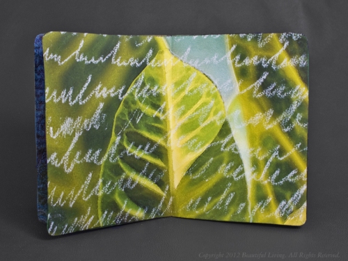
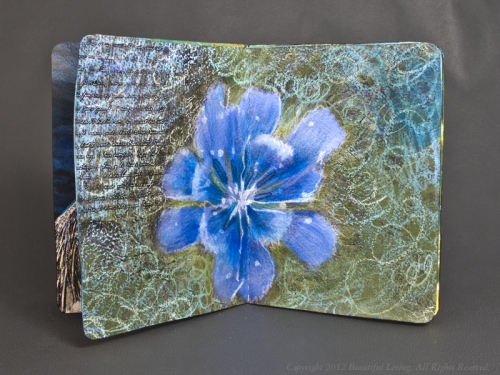
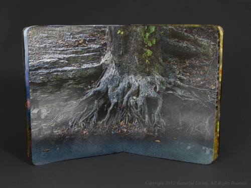
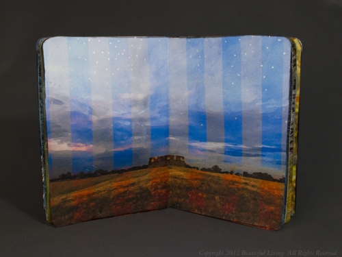
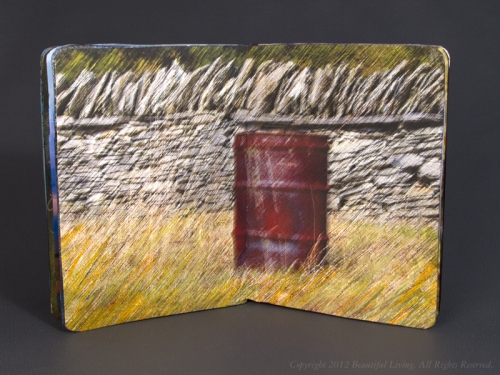
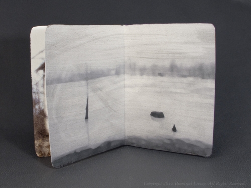
My submission included modified, digital photos I had taken around central Kentucky. I created twelve two-page spreads, each representing a month of out of the year. Each photo was printed on an Epson Ink Jet printer onto watercolor paper, and modified using pens, markers, oil pastels, gels and other artist mediums. Once complete, the pages were bound into a book a wrapped with a modified cover photo of beautiful Cave Run Lake in Daniel Boone National Forest, Morehead, Kentucky. These are the pages in the book, starting with the cover, January, February and so on.

To see the massive collection of sketchbooks at The Brooklyn Art Library, here is a link to the details: Brooklyn Art Library. If you want to get a closer look at my journal once you are there, the call number of my book is 194.12-9.

SB-2012-04

SB-2012-03

SB-2012-02

SB-2012
SB-2012-01
SB-2012-05

SB-2012-08

SB-2012-07

SB-2012-06

SB-2012-09

SB-2012-10

SB-2012-11

SB-2012-12

Read Full Post »

Are you interested in participating in a collaborative Sketchbook Project? Check out this post by Mari over at CreateWriteNow.com for details of an exciting opportunity for creative journalers.

Attention all creative journalers! Your art journals, travelogues, memoirs, to-do lists, short stories and other masterpieces are wanted to join a traveling exhibit with the Brooklyn Art Library.

The Sketchbook Project , created by Brooklyn-based company Art House, is a global collaborative art project that encourages anyone – writers, artists, accountants, mechanics, chefs, children, you! – to take a blank sketchbook, fill it with personal thoughts, designs and emotions, then return it by January 15 to be included in a traveling exhibition and permanent collection. Talk about journaling on a global scale!

Here are the basic rules:

  1. Anyone, anywhere in the world can participate (“This project is for anyone who craves an outlet for that undeniable creative bug.”). Thousands of people participate each year, and every sketchbook is a unique piece of art.
  2. It costs $25 to join the Sketchbook Project (and $30 more to digitize your book and make it available to anyone around the world – books receive half a million viewers each year), which includes a custom-designed 5×7, 32-page sketchbook made in Portland, Oregon.
  3. To participate in the 2013 exhibition, you need to send your completed sketchbook back by January 15, 2013. It will then go on tour, hitting cities across North America, including San Francisco, Austin, Toronto, Chicago and Atlanta. Your book will keep in touch from the road, sending you an email or text message updating you on its journey.
  4. Your sketchbook will then take up residence in the Brooklyn Art Library’s permanent collection and play an important part in journaling history.

Interested in participating in the Sketchbook Project this year or in the future? What kind of journal would you create? Share your thoughts in the comments, and read more about the project

Read Full Post »

I love what Jorge did with his Moleskine Sketchbook.

Read Full Post »

CraftyKatePalmer recently reviewed the Fiorentina Amalfi Leather journal on Youtube. If you want a closer look at this beautiful journal, be sure to check it out.

Read Full Post »

One of the journals in the Journey of Journals was themed “Journey”. I thought it would be interesting to create a spread that represented my journey of life in the form of a passport.

The first of two spreads designed to look like a passport, starting with my early life. I used PhotoShop to layer illustrations to give the images a stamped look.

A selection of images I created in CorelDraw and by hand were layered in PhotoShop to create a passport collage. I altered the illustrations to look distressed and to give the appearance of being hand-stamped. Once I was happy with the layout of the pages, I printed them out on my ink jet printer and pasted them into the journal. This type of collage can be created using any combination of photographs and images that you may have using PhotoShop’s powerful layers feature. The great thing about doing this digitally is that you can open it and make changes or additions in the future for  similar or entirely new images.

The second spread features the latter part of my life using similar stamped images.

If you click on the photos, you will see a larger version of the image.

Read Full Post »

One of the journals in the worldwide journal swap I participated in was filled with nature inspired illustrations.  My entries were of leaves, created with 2 types of markers, Copic Sketch Markers and Tombow Dual Brush Pens. Color blends were used in both images, but the Copic markers produced blends that were more translucent and ethereal in appearance, while the Tombow markers seemed bolder. Part of the difference may be due to the more graphic appearance of the first illustration, or maybe it is because the Tombow markers are water-based and the Copic markers are alcohol-based. Whatever the reason, the Tombow markers seem to produce bolder, sharper looking color.

This illustration was rendered using Tombow Dual Brush Markers. I added water drops to the surface of the paper using a glossy gel medium in small blobs.

The leaves were created using Copic Sketch Markers. The center of the paper was crimped to cover the spiral binding, the left and right sides of the paper was glued to the journal pages. The left side of the leaf in the center was cut out of the watercolor paper so it would pop up when the pages are opened.

Both markers are high quality, professional grade products but you may prefer one over the other depending on your project. The water-based Tombow markers are appropriate for use on paper-based surfaces and can be thinned with water like water colors. The ink is not permanent and will not bleed through your paper’s surface unless you you saturate the paper with too much ink. The permanent, alcohol-based Copic markers can be used on a variety of surfaces including paper, ceramic, glass, fabrics, metal, leather, plastic and more. Unless you are using Copic’s special marker paper, the Copic markers will bleed through most papers, however.

Copic markers are available in a variety of different sets and color combinations in both Ciao and Sketch marker styles in sets of 12, 24, 36 and 72.

Tombow Dual Brush Markers are available in sets of 6, 10 and 96. Primary, secondary, landscape, portrait and other color sets are designed to fit the needs of individual artists.

Read Full Post »

The June Carnival of Pen, Pencil and Paper is in swing at Note Booker, Esq. There are some really great posts this month. Sme of my favorites are:

Beyond the Pen: Fountain Pen Ink as Watercolor Wash posted by guest blogger Jamie Williams Grossman who has a sketching blog called Hudson Valley Sketches. She shares her techniques for creating washes out of saturated fountain pen inks and shares a list of her favorite inks.

Unquestionably The Coolest Notebook I’ve Ever Seen posted by Note Booker, Esq. introduces us to an exotic looking notebook purchased at Flax. The cover is part leather, part canvas and is filled with beautiful paper with a deckle edge.

Links to Artists Who Put Pens to Good Use posted by Inkophile who shares some great links to artistic journals and illustrations created with fountain pen ink.

Inside: A Ukrainian Sketchbook posted by Notebook Loves Pen shows us the inside of Ukranian artist’s Anna sketchbooks.

The Book Surgeon posted at Moleskinerie shows us some amazing examples of book art. Using knives, tweezers and surgical tools, he carves one page at a time, without adding anything but just cutting away some pieces of out-of-date encyclopedias, medical journals, illustration books, or dictionaries.

There are many more great posts, so be sure go visit Note Booker, Esq today. Submit your blog articles for the next edition of Carnival of Pen, Pencil and Paper using the carnival submission form. Past posts and future hosts can be found at the blog carnival index page, and you can read about the Carnival’s origins at Notebook Stories. Next month’s carnival will be hosted by Notebook Loves Pen.

Read Full Post »

Now that another journal has arrived home, I can post more of my journal entries made to Sue’s journal which was themed We Are All Unique. I found this topic challenging because I am constantly finding things I have in common with others and the world around me.

This illustration was created with embroidery thread, glue and tiny bead pearls.

For my first spread, I wanted to express that while we are all unique, we are part of something larger. I decided to use embroidery thread in varied colors to create a tapestry, which included hundreds of individual threads which contributed to a larger picture of swirling spirals. In the center of each spiral, I glued small pearls to add some sparkle and dimension. Since the tapestry was so thick, I stitched it onto the spiral binding rather than glue it to the pages of the journal. I used the pages of the journal as a background to the tapestry. Pan Pastels were used to get a smooth, graduated color and press-type letters were added on top. The type behind the tapestry reads We Are All unique Threads in the Fabric of the Universe.

The tapestry was stitched onto the spiral binding because it was too thick to glue to the journal pages. I used Pan Pastels to create a smooth background for the transfer type.

Using transfer type in your journals is a great was to add artistic text. It is available in a variety of sizes and styles from professional art supply stores.

On the next 2 pages, I continued the thread theme by scratching words and a scribble design into a bold background of oil pastels.

A thick layer of oil pastels provides a great surface for scratching designs and words.

Read Full Post »

Another one of the journals I worked on in the Journey of Journals project and returned home and I am able to post photos of the pages I created as well as the few pages that were in the journal when I received it. The theme of this journal was Strength.

Note: if you right-click any of the images and select View Image, you will be able to see a larger, more detailed image.

The journal is handmade with a vibrant fabric wrapped around paper signatures that are stitched into the fabric. Paula, the journal’s creator, did a beautiful job of connecting her imagery to the journal’s design.

The theme of this journal was strength. Paula's intro page included a small envelope for everyone to include their name.

Her first spread is a mixed-media illustration. I love how she used different patterns and textures to create the design. The layering of items gives the pages a sense of depth and history.

Paula's second spread is layered with rich, vibrant colors and images.

My spread was created by altering a photo of a wolf I took at the International Wolf Center in MN. The image was printing on plain paper using an ink jet printer. I used a translucent, white, iridescent paint on the photo to give the image an otherworldly glow. Inks were added to the dark areas to increase contrast.

Another photo from my visit to the wolf center was used for my second spread. Multiple paint and gel medium layers were used to give the photo a painterly effect.

You can view the Strength journal in its entirety at the following link: Paula’s Journal.

Read Full Post »

Older Posts »